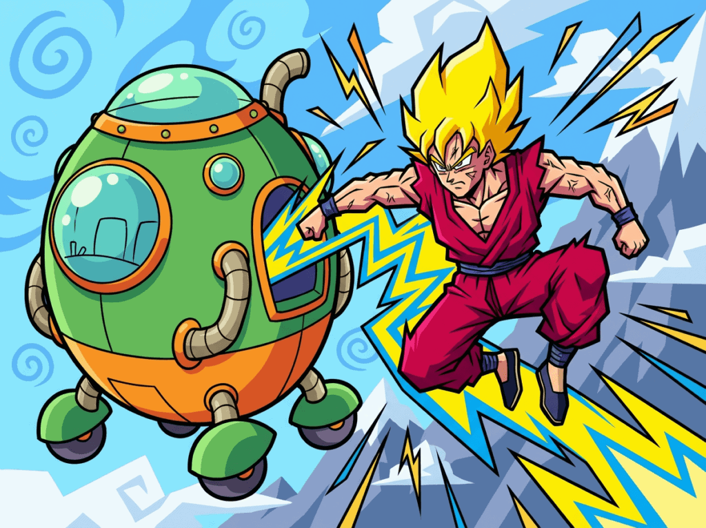
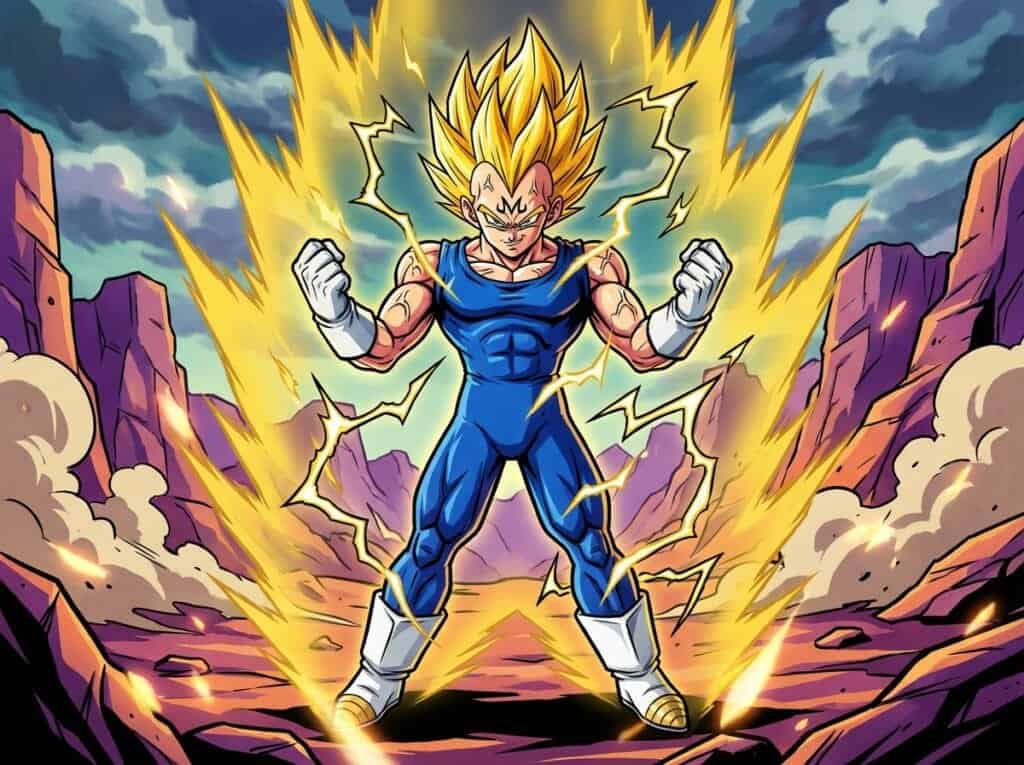
Few creators have left a mark on the world quite like the legend behind Dragon Ball. Looking back at his decades of work, I am always amazed by the sheer variety in his designs. The Akira Toriyama art evolution tells a story of its own, shifting from playful comedy to high-stakes action. It is a visual history that defines the look of anime for millions of fans.
I love tracing how his pen strokes transformed from the round, bouncy vibes of Dr. Slump to the angular muscles of the Cell Saga. Every era brought a new flavor that matched the growing intensity of the story perfectly. Seeing these changes side-by-side really highlights his genius and adaptability as an artist.
Key Takeaways
- Toriyama’s art style evolved from soft, comedic curves to sharp, angular intensity to mirror the narrative shift from lighthearted adventure to high-stakes combat.
- During the 90s action era, heavy shading and hyper-muscular character designs were utilized to add physical weight and grit to the series’ most iconic battles.
- Modern character designs have pivoted toward slimmer, streamlined physiques to facilitate cleaner visuals and more fluid fight choreography in modern animation.
- The continuous adaptation of the visual aesthetic ensured the artwork matured alongside Goku’s growth, preventing stagnation across decades of storytelling.
The Rounder Roots of Toriyama’s Early Style
When I look back at the very beginning of Toriyama’s career, the first thing that stands out is how incredibly soft everything looked. Before the intense battles took over, his background in gag manga heavily influenced the way he drew characters like Arale and Kid Goku. Their designs were filled with circles and soft curves rather than the sharp angles we see later on. This gave the world a bouncy and lighthearted feeling that matched the comedy perfectly. Even the vehicles and buildings had a rounded, almost rubbery aesthetic that made the whole world feel safe and fun.
You can really see this specific style shine during the first hunt for the Dragon Balls. Goku and Krillin were drawn with much shorter limbs and bigger heads, resembling the adorable chibi style that is popular today. Their muscles were barely defined, and they looked much more like actual children compared to the ripped warriors they eventually became. I always loved how expressive their faces were back then, with wide eyes and exaggerated mouths used constantly for comedic effect. It is a stark contrast to the serious glares we get used to seeing later in the series Dragon Ball chapter 1, Bulma and Son Goku.
The Transition to Angular Muscles and Intensity
As the story moved into the Frieza Saga, I noticed the soft curves of the early days began to vanish completely. Toriyama started using much straighter lines and sharper angles to show just how serious the battles were becoming. The characters stopped looking soft and started looking like hardened warriors ready for a fight to the death. You can see the jawlines becoming more defined and the eyes narrowing into intense glares that screamed power. This was the moment when the series truly left its gag manga roots behind to embrace a gritty action style Dragon Ball Z episode 47, Namek’s Defense.
By the time the Cell Saga arrived, the characters bulked up significantly to match the exploding power levels. I remember being blown away by the hyper-muscular builds that became the standard look for the Super Saiyans. Vegeta and Trunks eventually pushed this to the extreme with their bulky Ascended Super Saiyan forms Dragon Ball Z episode 155, Super Vegeta. Toriyama also changed his shading technique during this era to add more depth and weight to these massive figures. Instead of smooth gradients, he used heavy black shadows and stark contrast to make every muscle fiber pop off the page.
This specific era of art defined the intense look of 90s action manga that so many of us grew up loving. The combat felt heavier because the characters actually looked like they were made of stone and steel. Battle damage became more frequent and detailed, with blood and scratches emphasizing the brutal nature of the fights. It was not just about looking cool, but about making the reader feel every heavy impact through the artwork alone. This angular style remains the most iconic version of Dragon Ball for fans who love the high-octane battles.
Modern Simplification and Slimmer Character Designs
By the time we reached the final arc of Dragon Ball Z, I noticed the characters started shedding some of that extreme bulk from previous seasons. Toriyama began moving away from the jagged, intense shading that defined the battle with Cell to favor a look that was easier on the eyes. The art style became slightly rounder again but kept a new level of polish and consistency that looked incredible in motion. You can really see this change when Goku transforms into Super Saiyan 3 for the first time, as the lines are cleaner despite the raw power on display Dragon Ball Z episode 245, Super Saiyan 3. The muscles were still there, but they looked more natural and less like heavy action figures carved out of solid rock.
This evolution went even further when Dragon Ball Super introduced us to the concept of God Ki. I remember being honestly surprised that Super Saiyan God Goku was actually skinnier and younger-looking than his base form Dragon Ball Super episode 9, Sorry for the Wait, Lord Beerus. Toriyama decided that ultimate power did not always have to equal massive muscles anymore, which was a huge shift in his philosophy. The designs became much slimmer and streamlined, which allowed for faster and more fluid fight choreography in the show. It was a huge departure from the hulking physique of Super Vegeta that we all grew up watching in the 90s.
I think this modern style represents Toriyama settling into a comfortable and efficient way of drawing after so many years. The complex cross-hatching lines on clothing and skin were replaced with simpler and sharper shadows to create a sleek appearance. Characters like Cabba and the other Universe 6 Saiyans show just how far this slender design philosophy has gone compared to the early days Dragon Ball Super episode 32, The Matches Begin. While I sometimes miss the heavy grit of the classic art, this cleaner look feels fresh and fits the modern animation era perfectly. It proves that Toriyama was always willing to adapt and evolve his art rather than staying stuck in the past.
Why Toriyama’s Art Style Needed To Change
Looking back at all these different stages, it is clear that Toriyama never let his artwork stay stagnant. His willingness to evolve from soft, round shapes to sharp, intense angles kept the series feeling fresh for decades. I think this evolution is exactly what the story needed as Goku transformed from a little boy into a warrior battling for the universe. If the art had remained exactly the same as the early gag manga days, the high-stakes battles against villains like Frieza would not have hit quite as hard. The visual shift perfectly matched the growing intensity of the narrative.
Every single era of this artistic journey holds a very special place in my heart for different reasons. The bouncy charm of the early years reminds me of the pure sense of adventure that started it all. On the other hand, the jagged lines and heavy shading of the 90s capture the adrenaline of the most iconic fights in anime history. Even the slimmer, modern designs show a master artist who was still refining his craft until the very end. No matter which style you prefer, they all come together to form the incredible legacy of a true legend.
Frequently Asked Questions
1. What is the Akira Toriyama art evolution?
It is the visual journey of the creator’s style shifting from playful comedy to serious action. I love how it tells a story of its own, moving from the round vibes of Dr. Slump to the sharp intensity of later arcs.
2. Why did Toriyama’s early art look so round?
His background in gag manga heavily influenced those early designs with circles and soft curves. This gave characters like Arale and Kid Goku a bouncy feeling that matched the comedy perfectly.
3. How did Goku’s design change over the years?
Goku started with shorter limbs and a bigger head, resembling the cute chibi style we see today Dragon Ball chapter 1, Bulma and Son Goku. Over time, I watched him transform into a ripped warrior with angular muscles to fit the high-stakes battles.
4. Did the environment art change alongside the characters?
Yes, the buildings and vehicles originally had a rubbery and rounded aesthetic. This made the whole world feel safe and fun before the story transitioned into more dangerous territory.
5. What caused the change in the art style?
The shift happened because the story demanded more intensity as it progressed. Every era brought a new flavor to match the growing stakes, moving away from soft comedy to the sharp, angular look of the Cell Saga.
6. How were facial expressions different in the beginning?
The early chapters used wide eyes and exaggerated mouths constantly for comedic effect. It is a huge contrast to the serious glares and determined looks I see later in the series.


