
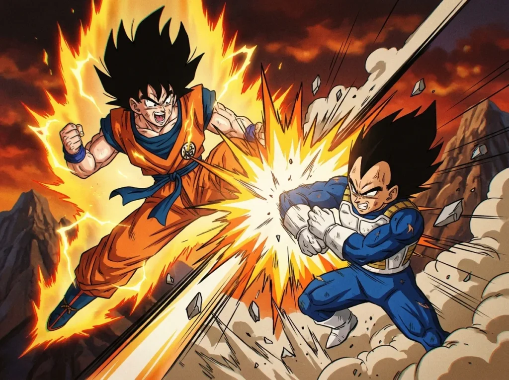
Dragon Ball’s manga paneling controls timing and emphasis. It decides how long a moment feels and how hard it hits, not just how a scene looks. Each panel is a small slice of time, and the size, shape, and order of those slices tell your eyes when to speed up and when to stop. Creator Akira Toriyama ran the series in Shueisha’s Weekly Shonen Jump from 1984 to 1995, and he has said that a larger panel can make a scene feel more powerful. Small, tightly packed frames rush a fight forward, while one wide image can freeze a single punch for a full beat.
Readers also tend to follow a predictable path across the page. In a 2014 review of comic layout experiments, participants followed the standard Z-path in 0.95 of cases using a regular grid, but only in 0.31 of cases when a layout blocked that route. This means a page’s layout can guide the eye or slow it down. Once you notice how panel size and placement work together, every fight in the series becomes easier to read and enjoy.
Key Takeaways
- Dragon Ball’s artists control pacing with panel size, so a run of small, tight frames builds tension and one wide panel lets a hit land with the weight of a full beat.
- Readers followed the standard Z-path in 0.95 of cases on a regular grid but only in 0.31 of cases when a layout blocked that route, so a clear reading path keeps fight scenes moving at the intended speed.
- Creator Akira Toriyama has said that a larger panel can make a scene feel more powerful, and that making every panel the same size can feel off.
- Double-page spreads and full-page splash pages are Dragon Ball’s largest tools, and they work best for big moments like Goku’s first appearance in the 1984 Weekly Shonen Jump issue.
- The Special Beam Cannon scene in Dragon Ball Super Volume 24 kept its panel sizes when it moved from a color magazine page to a monochrome book page, so its impact depends on contrast and shape rather than color.
How Does Panel Layout Shape the Way You Read Dragon Ball?
Dragon Ball’s paneling decides how fast a fight feels and which moment hits hardest, because each panel divides the page into a segment of time. A small frame suggests a quick instant, while a large frame holds the reader in place for longer. Manga scholar Natsume Fusanosuke describes panel organization in these terms, saying that differences in panel size, shape, and change can create a contrast between compression and release.
Compression is the feeling of pressure. Tight, crowded panels squeeze several small actions into a short stretch of page, so punches, dodges, and counterattacks seem to crash into each other with little room to breathe. Release works in the opposite direction. Open, quiet panels give your eyes space, slow the pace, and let a result sink in before the next wave of action arrives.
Good fight scenes usually move between the two. A run of cramped frames builds tension, and then one roomy panel lets you stop and feel the impact. You can notice these shifts even if you never learn the technical names for them, because the rhythm is built into the page itself.
The timing of these choices also matters for the series’ place in comics history. Dragon Ball ran in Shueisha’s Weekly Shonen Jump from 1984 to 1995, which put its action pages in front of readers every week for more than a decade. Because so many fans followed that run closely, its page design became a model that later action manga often borrowed from. The sections ahead look at specific pages, starting with how panel size changes the force of a single hit.
Why Does Panel Size Change How Hard a Hit Feels?
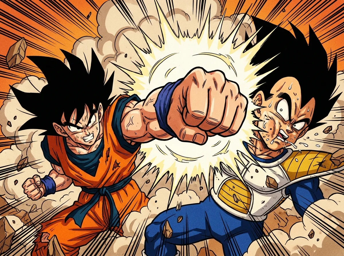
A larger panel makes a hit feel heavier because it gives the moment more room on the page and keeps your eyes there longer. Smaller frames do the opposite by moving you quickly from one blow to the next. In an interview excerpt, Toriyama said that a larger panel can make a scene feel more powerful, and that making every panel the same size can feel “off.”
Small, tight panels speed up an exchange. Picture a fight where six narrow frames show a punch, a block, a kick, a dodge, a second punch, and a counter. Each frame is a brief slice of time, so the sequence feels fast and crowded. Then the page opens up with one wide panel for the finishing blow, which stretches across the full width. That single image slows you down, and the hit lands with the weight of a full beat.
Uniform sizes flatten a page. If every frame is the same size, your eyes move at one steady speed and nothing stands out. Varied sizes create rhythm. Contrast between panel sizes on one page builds a pattern you feel without noticing, something like quick, quick, quick, then stop. You don’t have to count the frames to sense the shift.
Toriyama also cared about clarity in battle scenes. In a 2010 interview, he said that clearly showing where fighters are, how they relate to each other, the situation, and how the fight will proceed makes battle scenes easier to draw. Wide panels help with this because they have room to show distance and positions, so you know where each fighter stands before the next small frame cuts in.
Next time you read a fight, try tracing the frame sizes with your finger. Count how many small panels come before the wide one. Notice whether the page builds pressure and then gives you room to breathe. Once you spot that pattern, the impact of a single punch becomes much easier to feel.
How Do Double-Spread and Splash Pages Make a Moment Bigger?
Double-page spreads and full-page splashes are the largest tools Dragon Ball’s pages offer. They are used for reveals, transformations, and first appearances because they take up the most space and hold your attention the longest. A spread works best when you see it as one picture rather than two separate pages. Toriyama has said that readers take in an entire two-page spread at once, so the left and right sides have to work together. Researchers who study manga layouts treat facing pages the same way. A 2025 study of 10,122 facing-page images from 104 works found that layout features alone could help identify which manga a page came from.
A splash page is different because it usually holds a single image with no other frames around it. The story stops for a moment, and the picture becomes the whole event. That is why splashes are saved for big moments. The official Dragon Ball site notes that a panel in Weekly Shonen Jump 1984 No. 51 marks Goku’s first appearance on the manga page. Placing a new hero in a clear, uncluttered image lets readers meet him without anything else competing for attention.
Shenron’s first appearance in the manga shows how a reveal can be built on page design alone. The dragon is long and winding, and a large image gives its coils room to fill the page. Because the reader has no other panels to look at, the dragon seems to take up the whole world of the story. The page does the work that a sound effect or a line of dialogue would do in a smaller frame.
Spreads often combine a big image with smaller panels that handle the buildup. A common pattern is a column of small frames on one side showing hands gathering energy, a rising expression, or a fighter setting his stance. The wide image on the other side then delivers the result. The small frames make you read quickly and feel the tension grow, and the large image lets that tension break open all at once.
How Does Action Flow Across a Dragon Ball Page?
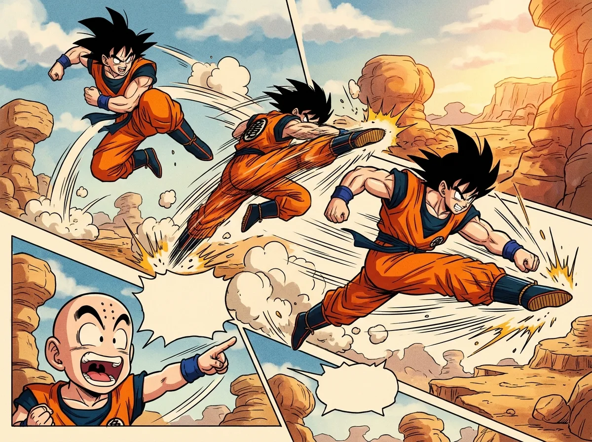
Action in a Dragon Ball page usually moves in a predictable path, and the layout either supports that path or interrupts it. Readers tend to follow the standard Z-path: across the top row from left to right, diagonally back to the left, then across the bottom row. The research on comic layouts measured how often readers stuck with this route in different designs:
- Regular grid layouts: readers followed the standard Z-path in 0.95 of cases.
- Staggered layouts, where panels shift out of a neat row: 0.89 of cases.
- Separated panels, with gaps that break the flow: 0.71 of cases.
- Layouts with blockage, where a panel sits across the route: 0.31 of cases.
The drop-off tells you something useful. When a panel blocks the path, your eyes have to search for the next frame, and that search slows the action down. Dragon Ball’s artists mostly keep the route clear in fight scenes, so the punches land in the order you expect.
Toriyama’s fight staging goes beyond flat grids. Former editor Kazuhiko Torishima recalled that Toriyama pushed action toward the reader instead of keeping it sideways across the page. Torishima also pointed to the square Tenkaichi Budōkai platform and its out-of-bounds rules, which let fighters move in several directions and at different heights. A character can leap above the frame’s center, drop toward the viewer, or fly off to one side, and each change in height tells you where the fight is heading.
Staging like this works because each panel shows a clear location on the ring. When the platform’s edges and the fighters’ positions stay consistent from frame to frame, you can tell who is attacking from which side without reading every word.
Here is a simple way to test this on any fight page. Put your finger on one fighter, then move it panel to panel in reading order. Note whether that fighter drifts toward the edge, rises into the air, or stays at the same height. Then do the same for the opponent. The two paths usually show you the direction of the fight, and you can see where the momentum turns by spotting the panel where the two paths cross.
How Do Transformations, Sound Effects and Emotion Work in Dragon Ball Panels?
Transformations, sound effects, and emotional moments are built into Dragon Ball’s panel layout. Artists use frame size, placement, and order to control how power builds, how fast a scene moves, and how a character’s feelings land.
A transformation usually plays out over a sequence of panels that grow larger or change shape. The early frames may be small and tight, showing a clenched fist or a rising expression. Then the frames widen, and the final image takes up the page. Goku’s first Super Saiyan change in the fight against Frieza follows this kind of build, so each step feels like more power being released. [Dragon Ball Z, Goku’s Super Saiyan transformation against Frieza]
Sound effects work as timing tools as well as noise. Large sound words often sit in the gutters, the white gaps between panels, or stretch across several frames. When a sound crosses a border, your eye is pulled forward into the next image, which makes the impact feel like it arrives at the same moment as the noise. Because the sound is part of the layout, it can speed a fight up or stretch a single beat without any extra narration.
Quiet panels do the opposite job. A close-up of a face, a tight shot of tensed eyes, or a small figure standing still gives you a breather before a large action panel. Gohan’s Super Saiyan 2 moment in the fight against Cell shows how this works. The strain and anger in his expression come first, so the burst of energy that follows feels sharper. [Dragon Ball Z, Gohan’s Super Saiyan 2 fight against Cell]
The order of these panels matters as much as their size. A calm face, then a wide burst of energy, then a tight cut back to the opponent creates a rhythm like a held breath followed by release. Try reading a transformation page slowly and mark which panels are small, which are wide, and where the sound effects sit. You will usually find that the emotional beat comes just before the biggest image.
Is Dragon Ball Manga More Colorful Than Its Anime?
No, Dragon Ball’s manga is not more colorful than its anime. The anime fills every frame with color, while the manga is mostly black and white ink, with color appearing only on special pages. What the manga does instead is use the page itself to shape the action.
Anime and manga handle motion in different ways. An anime uses time on screen and camera movement, so a pan or zoom guides your eyes while the episode plays at its set speed. A manga has no moving camera. Its creator uses space on the page to control pacing, deciding how big each frame is, how many fit in a row, and how long your eyes stay in one place.
Color pages add another layer. Magazine issues often carried color art, and that art can look very different from the version that later appears in a collected book. Dragon Ball Super began serialization in V Jump’s super-sized August 2015 edition, which was published in June 2015. Readers who first met the series in that magazine saw its early pages in print, with color art that the book did not always keep.
The gap between magazine and book shows up clearly in a recent example. Dragon Ball Super Volume 24 went on sale in Japan on April 4, 2025. Toyotarou said the Special Beam Cannon scene appeared as a color page in the original magazine but as a monochrome page in the book. The layout stays the same, but the bold color is gone, so the scene depends on contrast and shape instead.
Magazine art and book printings can differ in a few ways. Full color can make a burst of energy pop, while a black-and-white volume turns that same energy into light and dark tones. If you compare the two versions, check which one you are reading, because the panel sizes and order may match while the emotional punch feels different.
Which Iconic Dragon Ball Panels Show Layout at Its Best?
Three moments from the series show how layout can carry a story beat: Goku’s debut, Piccolo’s sacrifice, and the father-son Kamehameha against Cell. Each one leans on a different tool, whether that is size, spread, placement, or sequence.
- Goku’s first appearance (placement): Goku’s debut in the 1984 Weekly Shonen Jump issue sits in a clean, uncluttered image. Nothing crowds the frame, so the new hero is the only thing your eye can land on. This matches the splash lesson from earlier, where a single clear image introduces a character.
- Piccolo’s sacrifice (size contrast): The build-up to Piccolo’s final stand uses a run of smaller frames that squeeze the action together. A wider frame then gives the sacrifice room to land. This is the compression and release pattern in practice, with tight panels building pressure before the open image lets the moment sink in.
- The father-son Kamehameha against Cell (spread): The joint blast needs space to feel huge, so the image stretches across the full width of the page. Because a spread is read as one picture, the energy seems to flow from one side to the other, and the eye follows it in a single sweep.
Each example works best when you read it in order. Start with the smaller panels, notice where the page opens up, and then check where your eye goes next. That path shows you how the artist wanted the moment to hit, even before you read a single line of dialogue.
Studying Dragon Ball Panels on Your Own
Pick one fight you already know well, then choose a single page from it and count. Write down how many panels appear, how many are wide, and where the first full-width frame falls. Doing this for three or four pages will show you the artist’s habits more clearly than any description can.
Next, try comparing two versions of the same scene if you can get them. Check whether your copy is a magazine reprint or a collected book. The Special Beam Cannon scene from Dragon Ball Super Volume 24 is a good one to look for, because its color page in the magazine became monochrome in the book. Notice whether the panel sizes stay the same while the mood shifts.
For background before you start, the VIZ Media Dragon Ball page gives an overview of the series and its publication history. Use it to find the edition you want to study, and pick a volume with a clear fight, such as a tournament or a battle against a major villain.
Bring a pencil and mark each splash page and double spread as you go. Then reread the pages in order. You will likely see that the biggest images appear right after a run of tight frames, which is the rhythm the rest of this guide has described.
Frequently Asked Questions
1. Can I use Dragon Ball panels as drawing reference?
Dragon Ball panels work well as study material for learning how frame size and order build tension. Focus on the sequence of panels rather than copying single faces or poses. Trace how small frames lead into one wide payoff image, then try planning your own fight page with the same rhythm.
2. How many panels usually fit on a Dragon Ball manga page?
There is no fixed number of panels on a Dragon Ball page, because the count depends on how the artist sizes each frame. A fight page full of narrow frames can hold many small panels, while a page built around one wide image may hold only a few. The count changes with the pacing the page is trying to create.
3. Do Dragon Ball Super panels use the same layout tricks as the original series?
Dragon Ball Super uses the same basic tools of panel size, placement, and sequence to control pacing. The Special Beam Cannon scene in Volume 24 shows that the layout can stay the same between the magazine and the book, even when the color is removed. That means the rhythm you learn in the original series still applies when you read Super.
4. How can I tell whether a panel’s size or its position is doing the storytelling?
Cover the panel borders with your hand and check whether the image still makes sense in order. If the moment only feels big because it follows a run of tight frames, the size is carrying the beat. If the image feels important because it sits at the end of the reading path or cuts across the Z-path, placement is doing more of the work.
5. How do I plan a manga page with strong panel sizes?
Start by deciding which moment is the payoff, then give it the largest frame on the page. Place smaller panels before it to build pressure, and keep the reading path clear so the eye lands where you want it to. Sketch the page as small thumbnails first so you can test the size changes before you ink the final lines.

